An Artful Abode
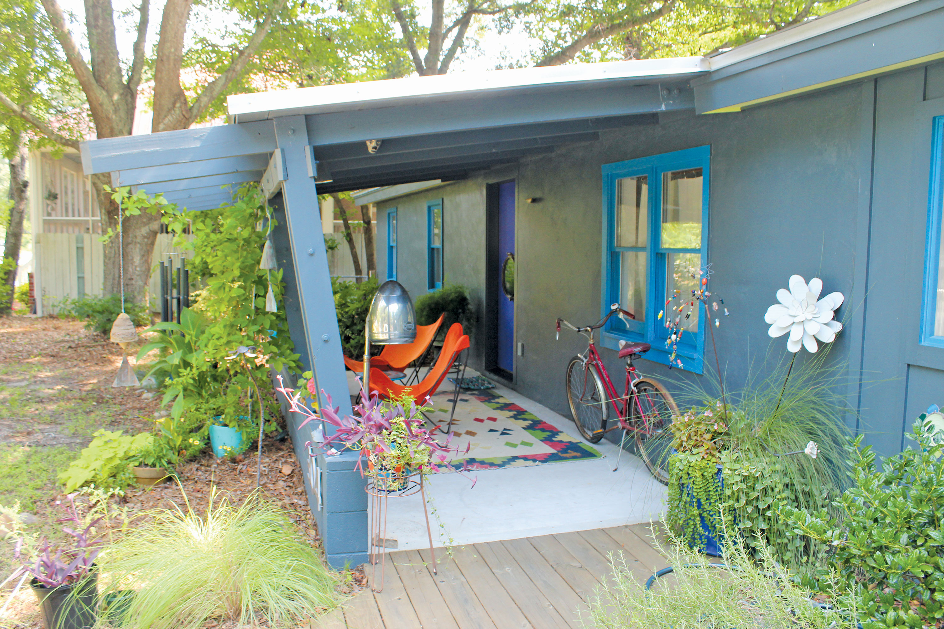
Southport artist Hilary Meehan, also the owner of Lantana’s Gallery and Fine Gifts, styles her completely remodeled home in complementary modern and retro accents. Photo by Bethany Turner
Creatives, by nature, are some of the most interesting people. Their ways of viewing the world as a whole, as well as all its minute details, can shed light on new perspectives for us all. While we haven’t pinpointed all the sciences behind what makes one artistic, there are ways to find greater understanding behind their artistic styles. One of those ways is to snoop through their house.
A home, often, is a reflection of who we are, what we enjoy, what we find practical, and what we find beautiful. In the case of Southport artist Hilary Meehan, owner of Lantana’s Gallery and Fine Gifts (113 S. Howe Street), those things include the deepest colors of the spectrum and funky, eclectic prints. It’s all a part of making her first house an extension of her work. “I wanted a blank canvas,” she describes. “I really wanted a place to renovate and make my own finally, because I’ve rented for years.”
In 2010 in Southport, she found a 1958 ranch house that was as close to a blank canvas as she could probably find in a home. The building was nothing but pale tones on the outside and white shades on the inside. The architecture, or lack thereof, was a great base for Meehan to start her project.
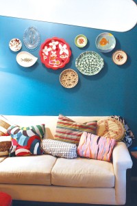
Meehan loves varying prints and textures, as shown on her living room couch and walls. Photo by Bethany Turner
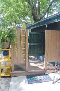
“I added the front porch, back screened porch, driveway and park pad, patio out front and back, and an outdoor shower,” she tells of the outdoor renovations. “Half of the house was one big, giant, open room, so I remodeled it to have an art studio, which technically is a second master bedroom, because I wanted to be able to close off my studio and make a mess in there.”
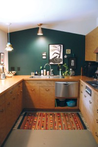
The kitchen, Meehan quips, was “1980s chic.” Going back to the home’s roots, she discovered cabinets from the ’50s she loved while searching online. The cabinets, however, were located in St. Louis. “It was like $300 for the whole set of cabinets, so my sister and I flew out there,” she recalls. “We rented a box truck and the guy helped us load them up. I have the original cooktop and vent. A contractor hooked that up to work for us. Then I added modern touches. These appliances are all brand new. I stained the countertop to mostly match, so it’s monochromatic. So there’s a modern industrial but also retro thing going on.”
Light fixtures reflect the modern appliances, though not all of them are from this century. The two influences blend so well, in fact, that it would be hard to decipher which fixtures are from what era.
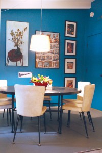
The dining room features art from Meehan and artists whose works she enjoys, as well as one theme of the house: bold colors. Photo by Bethany Turner
The remodel inside the house didn’t stop at new cabinets. Actually, the kitchen is now on the complete opposite end of the home. “The old kitchen is where my studio is now. The windows were looking out on just a fence, and I wanted to be able to look out at my backyard.”
So, Meehan did the flip. She added walls to shut off the studio and create a living room, dining room, and hallway office space. Because the walls blocked the natural light that floods the studio from getting to the living room, Meehan put in a large, horizontal, oblong window that adds architectural appeal and a little sunlight.
The few pieces of original design to the house did stick around, though, and Meehan developed upon them. “In some parts of the house, you’ll see we have the old exposed beams. We sort of extended that concept through the front and back patio ceilings.”
Four years later, a tour through Meehan’s home looks like she had it all planned out. Indeed, she has a background in both art and architecture. But there was one aspect she had trouble nailing down: paint.
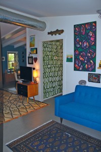
Sitting area and “homemade wallpaper,” or a loop-de-loop paint design Meehan crafted in green for her hallway. Photo by Bethany Turner
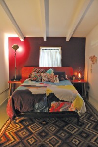
“It was hard finding my bedroom color; I painted it probably four times in the process of figuring out what it was supposed to be,” she says. The room went from painted patterns and various colors, to finally two rich purple-magenta walls and two white walls. “What I realize is, I love bold, deep colors, but you have to balance it with white. They’re basically accent walls.”
The accent theme repeats in the living room, where deep teal opposes white walls, and the kitchen features one dark hunter green wall.
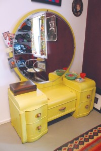
In her bedroom, Meehan also put up walls to create a great walk-in closet. It has enough space that it hosts a chair and a vanity. “It’s my dressing room, and there’s no turning back to a regular closet after having this in your life! I’ve had the [vanity] since high school; the hair dresser across the river from my hometown had all these vintage dressers, and somehow my mom convinced him to sell us two of them, and my sister has one and I have one. It’s been a variety of different colors. It’s a really special piece, probably from the ’40s.”
Her style pops up in the paint, patterns of pillows and rugs, and in art throughout the house, whether it’s her personal work or another artist’s. And where she felt a brush of creativity, she applied it. The hallway is painted with kelly green loop-de-loops. “It’s sort of homemade wallpaper,” she muses.
“I love color, texture, and patterns,” Meehan affirms. Texture appears in an unexpected location in her bathroom, as she placed a mosaic in the tub. An orange hibiscus flower, an anchor, pink and a plethora of random, colored tiles come together for a fun, unexpected work of art.
“I completely renovated the bathroom; this is probably my favorite room,” Meehan begins. “There is glitter with an epoxy coating on the counters. I found the sink and toilet on Craigslist in Raleigh, because I wanted pink, antique fixtures. I tiled the whole tub myself. I have a sketchbook and I drew out a lot of different design ideas for what it would be: rain drops, circles, a pattern. I do love flowers and this is a nice tropical flower. I have a porthole in the front door and there are some nautical details in the house. So I liked the anchor, which is actually hanging from a [tiled] chain which comes over the shower head and wraps around the flower stem, so they’re holding each other.”
The smorgasbord of colored tiles comes from a speed bump she encoutered during the process. “I ordered lots of different tile samples to find a color I wanted and found this awesome pink, but in the middle of tiling all this, they stopped producing that pink,” she concedes. “So that became its own little challenge. I put all the other colors that I loved and mixed them together and just went with it, and I think it turned out great, because I love it.”
Her contractor contributed by laying the larger white tiles, and Tim’s Towers (524 N. Howe St.) supplied custom finishes and a custom shower rod. “He does boat towers, but he can do residential bits,” Meehan muses.
“This was a fiberglass tub prior, but when we pulled it out, we found the window,” she continues. “It was just covered with plywood, totally hidden, so that was a nice bonus feature. Now the tub is long enough to put my legs all the way out. Baths should be comfortable!”
As an artist, Meehan would love to do custom mosaics for people in their homes or businesses, whether in the shower or elsewhere, now that she’s completed the large job herself. “I gained massive amounts of experience with mosaic tiling, doing this tub,” she reminds. “These are not sheets. Every single one of these is hand-tiled.”
At times Meehan seems ready to move on to the next blank canvas, to buy a new home to create in. “I’d love a new project and a new challenge,” she says.
But many times she points out a new design feature she can add to her first home, even four years in, and one remembers: An artist is never really through with their art.
“It’s a work in progress,” she amends. “I’m always tweaking it.”
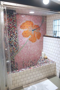
Meehan hand-tiled her mosaic tub with an original design of her own creation. Photo by Bethany Turner
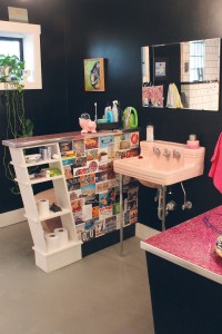
Black walls allow the pink bathroom fixtures to pop; Meehan found the fixtures in Raleigh, NC. Photo by Bethany Turner




Leave a Reply